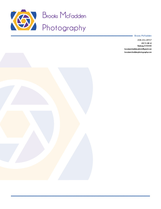

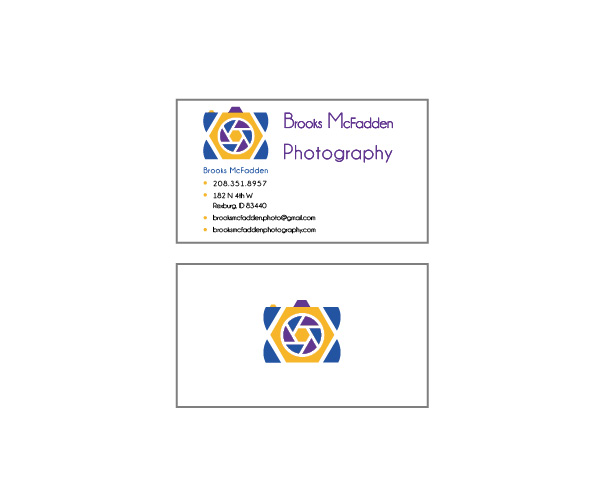
Description:
- A matching logo and letterhead designed for a business.
Process (Programs, Tools, Skills):
- I designed the logo in Adobe Illustrator. To create the icon I started with a hexagon and circle. I drew out lines from the edges of the hexagon to the edge of the circle. I expanded and divide. I used the pen tool to draw the rounded triangular shapes in the circle, placed them behind the circle shape, and filled them with the blue and purple. I repeated the same shapes throughout the rest of the logo.
Message:
- The camera icon sends the message to the audience the business is about photography. The logo provides the audience the knowledge of who is a part of the business in the name itself. the icon remains fairly simply using geometric shapes, but the entire design provides a professional feel.
Audience:
- The design reaches out to anyone in need of photography services.
Top Thing Learned:
- I learned how to use two different adobe programs to create one design. I loved the interaction between the two and the way they work together made sense. I understand a little more of how one is different from the other, but aim towards the same goal of creating designs.
Color scheme and color names:
- Split Complementary: gold, blue and purple
Title Font Name & Category:
- Champagne and Limousines, Sans Serif
Copy Font Name & Category:
- Champagne and Limousines, Sans Serif

Brooks:
First I like the colorful draw in. That mixed with the shapes makes the image of your graphic very eye grabbing. The use of the white space in between the shapes is superb. I also like the angle of the shapes. Because they draw the eye to the center of the shutter. Lastly, I like the simplicity.
Check mine out:
https://greyninja17blog.wordpress.com/
LikeLike